
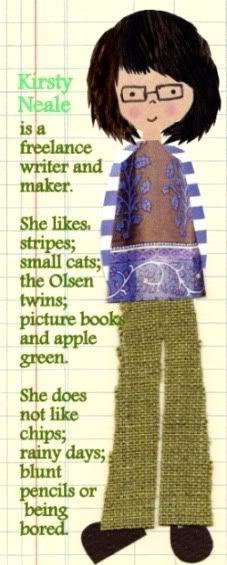
'I'm so envious of Kirsty's colour sense'
OK, so it was partly because I’m anyone’s for a few kind words and a pat on the head, but it also meant a lot because I’m so very fond of putting together new colour combinations. Like everyone, I have my old favourites, but working out (or stumbling upon) a fresh colour scheme is a particular kind of thrill.
Alongside the more obvious method of doing this – spread sheets of paper/fabric/paint swatches out on the table, move them around, stand back, squint a lot – I have another little trick you might want to try. It’s all about inspiration, the results are often quite surprising and it’s also less likely to give you wrinkles than all that squinting.
You will need:
:: Your computer
:: Favourite or interesting images (I most like working with photographs and illustrations - try browsing Flickr, We Heart It or your favourite online stores for inspiration)
:: Software which includes a ‘dropper’ tool (I use either Photoshop or PowerPoint, but it will work in Word, too)
:: Printer and paper if you want to print out your colour swatches
What to do:
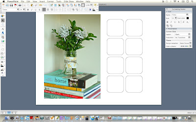
:: Open image in your chosen application (I’m using PowerPoint for these images), and create a series of boxes alongside it. Don’t worry too much about the number – you can always add more as you go along.
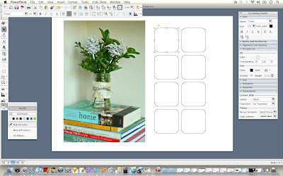
:: Click one of the boxes to select it, and then go to the 'fill colour' icon (it's a little bucket in PowerPoint). Click on the dropper tool ('pick fill colour'). Your cursor should change from an arrow to the dropper tool.
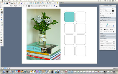
:: Repeat to fill the other boxes with different colours from your photograph in the same way.
The chances are, at least some of the shades your eyes see in the photograph won’t look the same when you take them out of the photograph. Don’t be put off, though. Take as many samples as you like – more than you need – and move around the image. Shadows and light can play a huge part in altering the way a colour looks, so it’s worth taking a few samples from a single object to see how the shades vary.
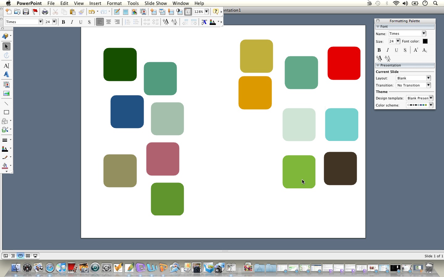
This is the first set of samples I took from my image (you can see I ended up adding quite a few extra boxes in the end):

Not exactly an inspiring or cohesive colour combination, right? It looks messy rather than pretty, so the first thing you need to do is prune and hone. To get a better sense of the shades that work best, I usually take the black outlines off the boxes, so they’re just sitting on the plain white background.

Deselect the boxes, and already things are looking a little better.

Next, start moving things around. Set aside any shades you’re not keen on (don’t delete them just yet), and rearrange those you like. It’ll probably help to move your photo out of the way, or work on a fresh page at this point.
 Keep honing and pruning – moving things around – until you’ve got a combination you’re happy with. You can now delete the other boxes and line up your finished swatch next to the source photograph.
It works with all sorts of images, and is a wonderful way of taking a photograph or illustration you love and using it as the basis for a project of your own, without directly copying it. Here you go with a few more examples.


If you feel inspired to give it a go yourself, I’d love to see what you come up with. Feel free to have a nosy round my Flickr favourites or Julie’s for some fast-fix inspiration!


6 comments:
Okay, so this is only my second visit to your blog, and already I'm finding stuff I've never thought of and ideas I'm dying to try out!
This is such a clever idea. I've probably done something like this before - a century ago, at college - but not in quite this way and with such great results!
Must go and try it out... excuse me, I may be a while...
Thanks Kirsty!
Not only are these great colour combinations, but you've chosen some of my favourite photographs to work with as well. You star.
This is such a fantastic idea, gorgeous colours and examples, something I am definitely going to try!
jo x
Just found your blog and there is so much inspiration - thank you. Am loving this idea - will have to try it.
Fabulous idea - will definitely give it a go.
How did I not see this before? (I'm going to use that word twice in a day... wait for it) Awesome. I can now have my very own Kirsty's Kolour Kombination Katcher. Love it.
P.S. Glad I made you smile :)
Post a Comment